Quanteda and Textual Analysis
Analysis of Biden-Xi Summit Speeches
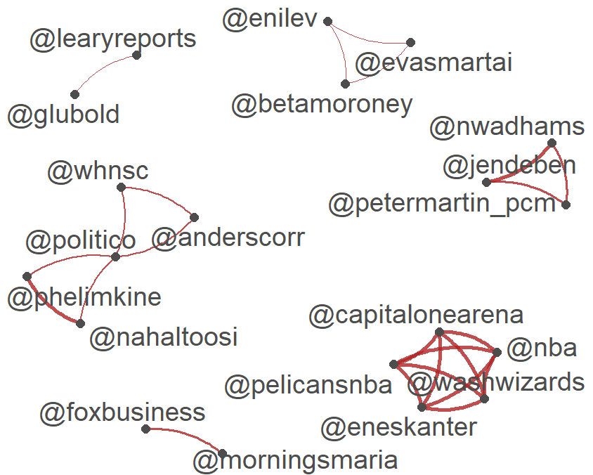
From the built in data in Quanteda, we can see popular accounts that tweeted about the summit.
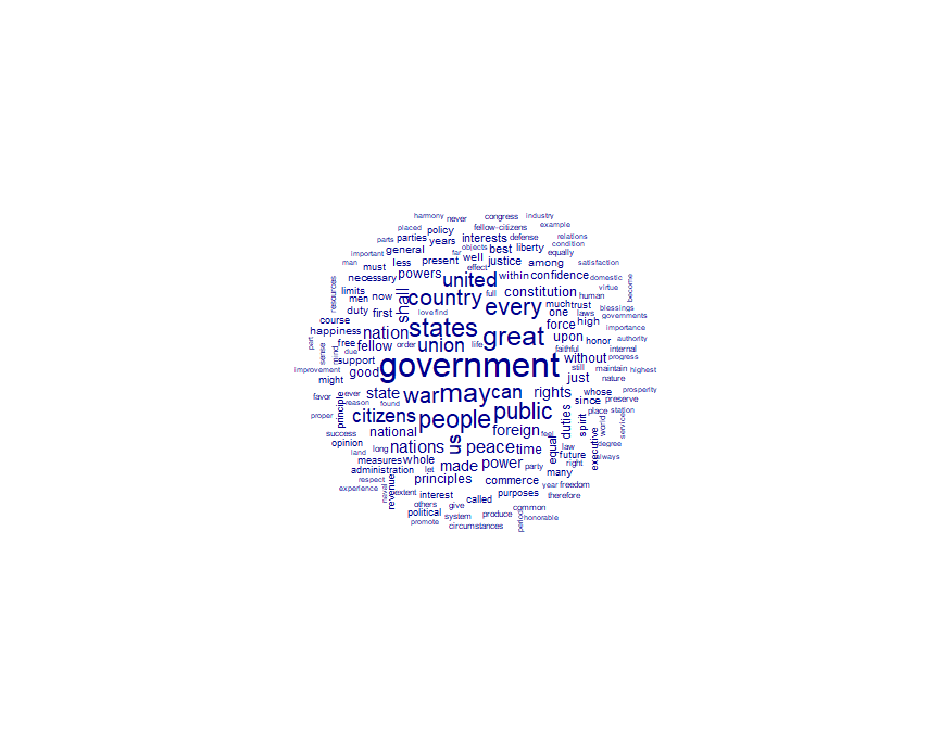
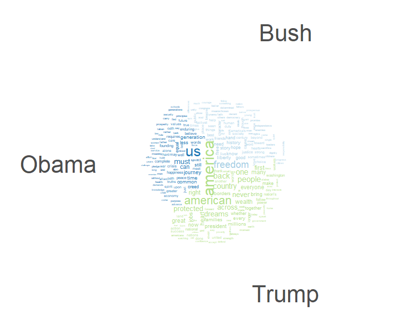
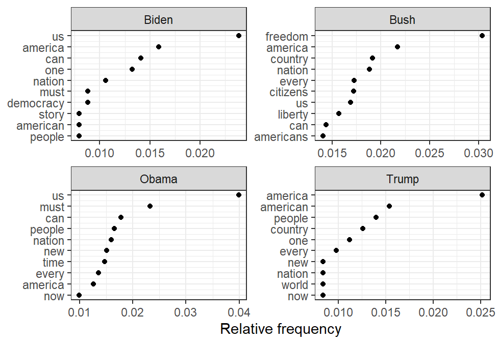
Analysis of Presidential Speeches
Using the wordcloud analysis, the most common words can be highlighted.
This can also be broken out by president, with Bush, Obama, and Trump’s most frequent words seen below.
These words can then be graphed by their frequency, as seen for the previous four administrations below.
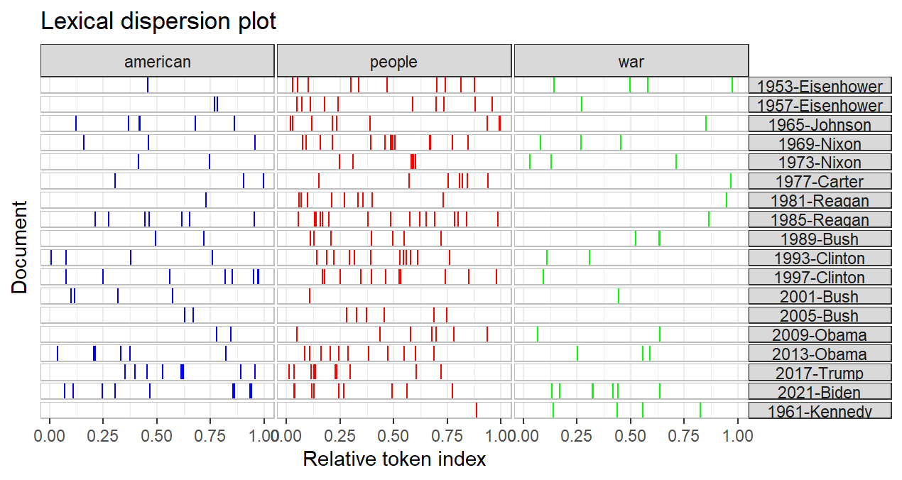
Using an x-ray plot, the frequency of specific terms can be seen across different administrations below.
Wordfish
Wordfish aligns words dimensionally based on relationships between them. It’s used to arrange words ideologically, especially in politics. It’s based on the frequency of the words used and their frequency in relation to other words and assumes a single-dimension to words and that users with such beliefs use the words more frequently. It generates a roughly curved graph that looks like a fishtail, hence the name.